![]()
![]()
VINE MADE
Overview︎︎︎
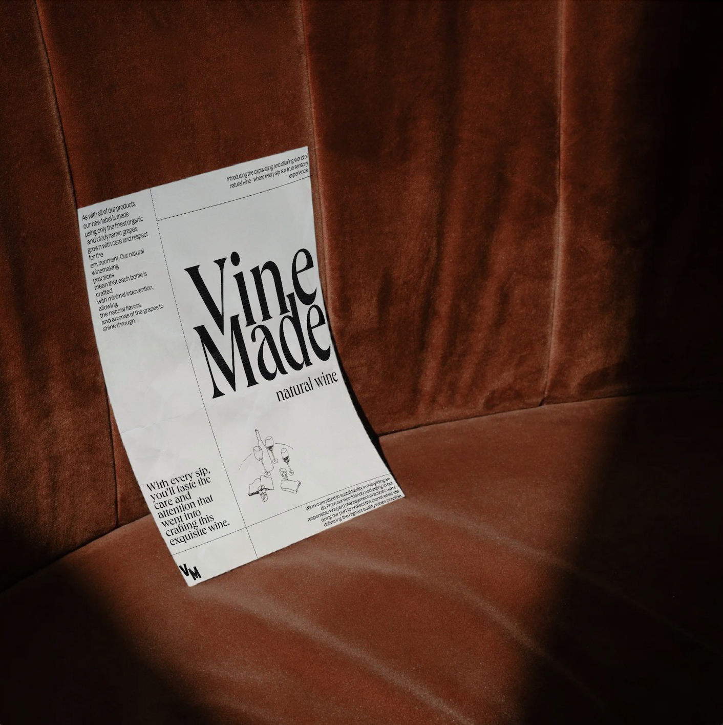
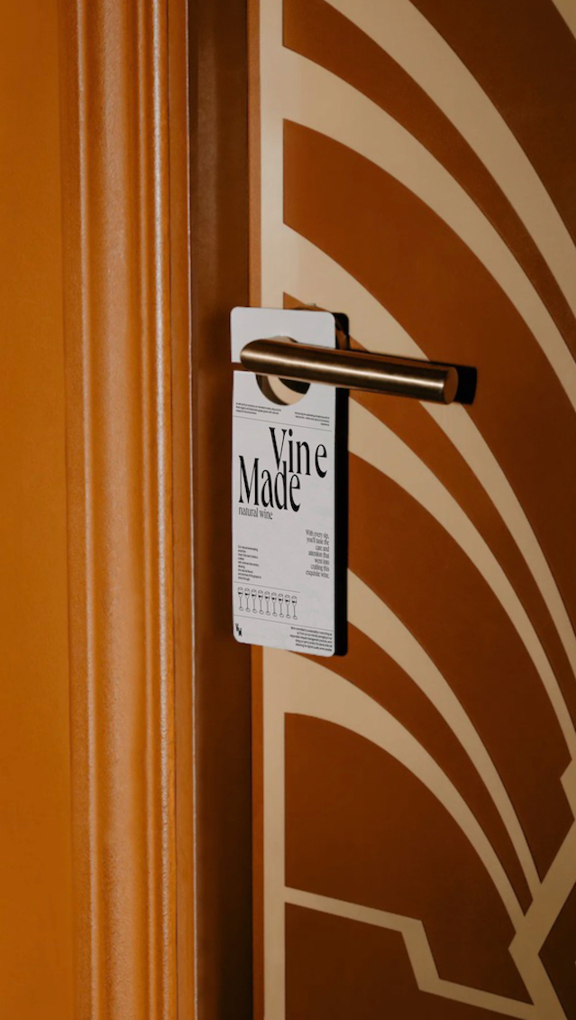
Over the course of a month, my role for this project was to establish a unique brand identity for Vine Made that would resonate with their target audience and set them apart from other natural wine competitors. After researching the natural wine industry, I discovered that the market was saturated with wine brands using similar design elements. I started by developing a logo, versatile color palette & typography that represents Vine Made's ethos incorporating an earthy + organic hand drawn feel. Using the established brand guidelines, I designed packaging as well as digital assets including a desktop landing page and 6 Instagram posts + 3 stories showcasing the brands personality.
Services︎︎︎
Brand Identity
Art Direction
Label Design
Social Media Design
Logo Design
Landing Page
Credits︎︎︎
Client
Individual Concept Project
Role
Lead Designer + Art Director
Location
Long Beach, CA (2022)



Logo︎︎︎
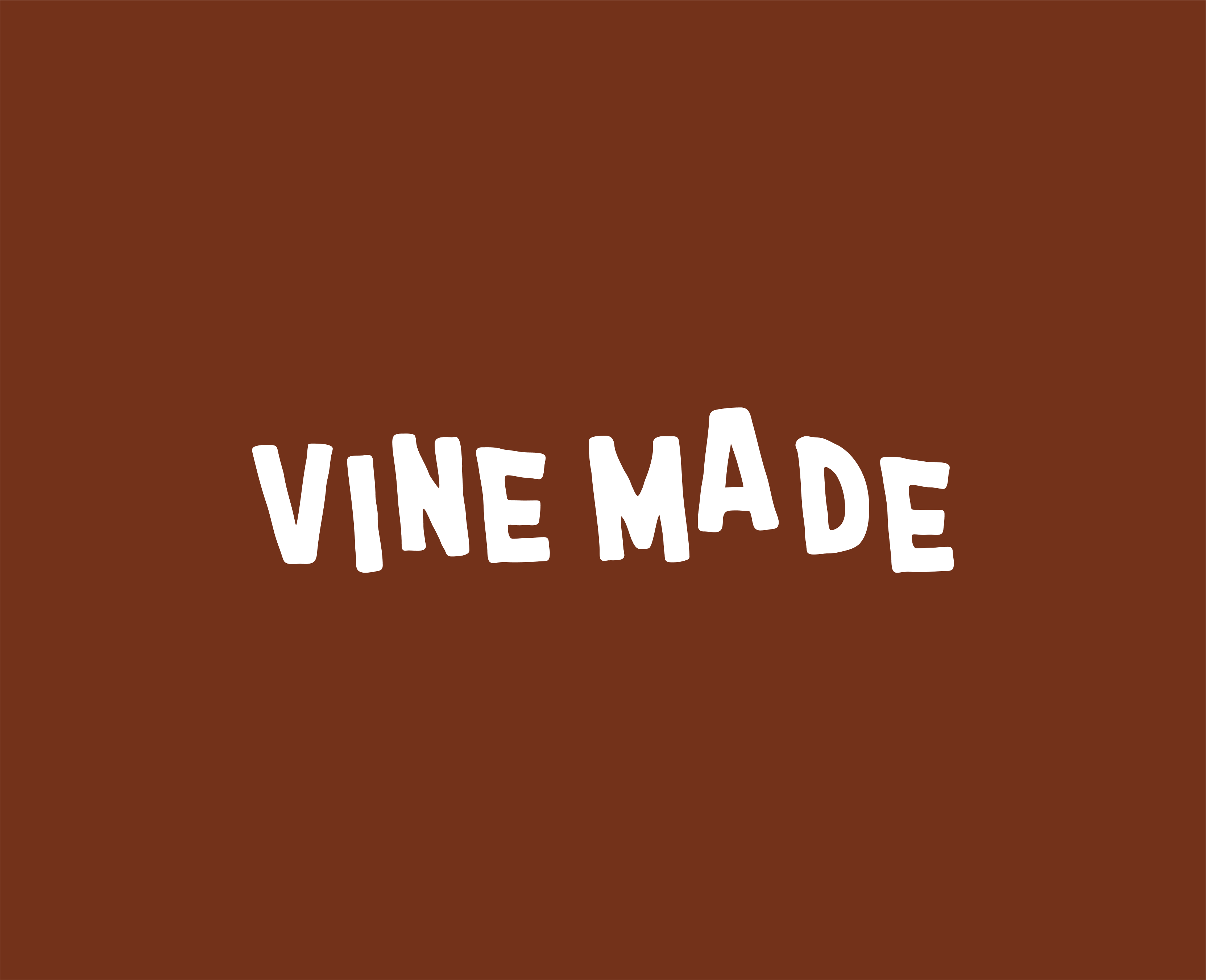
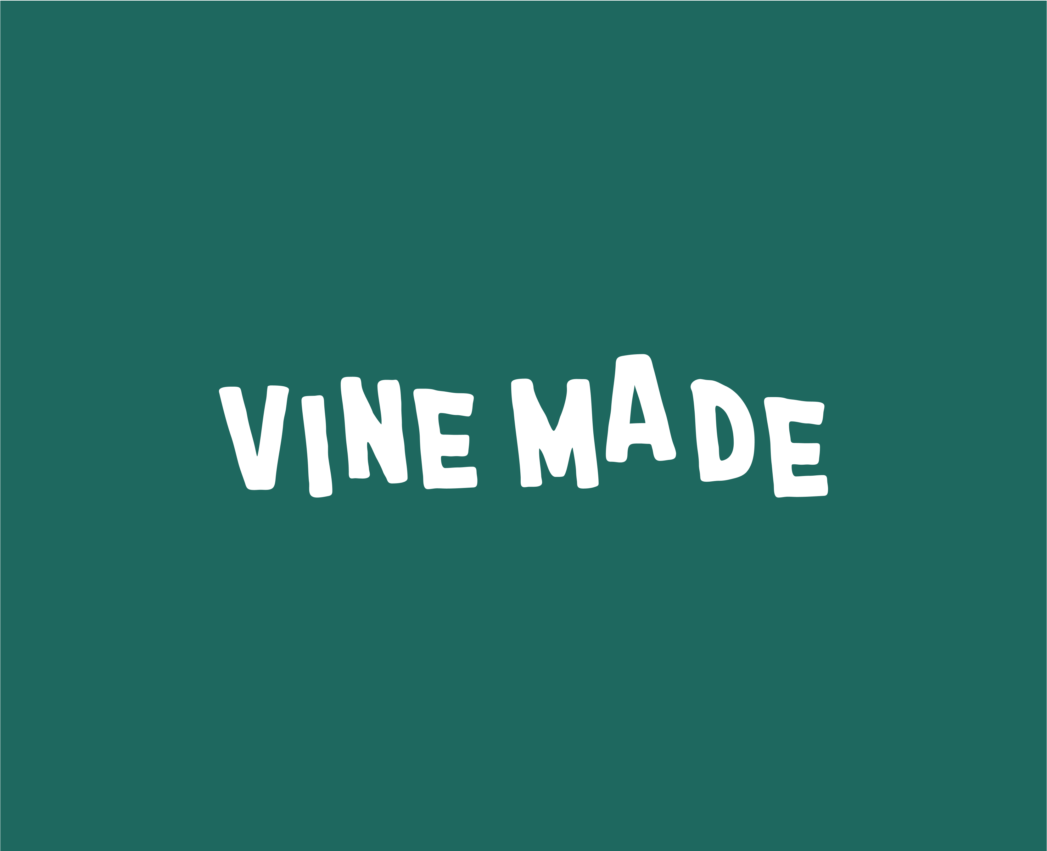
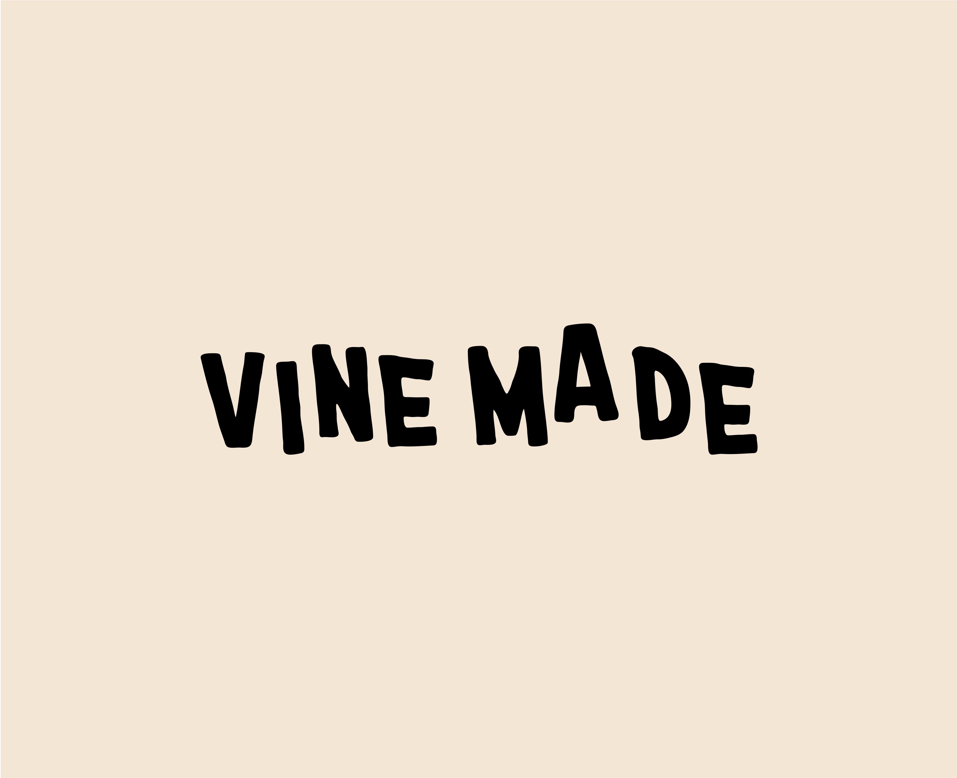
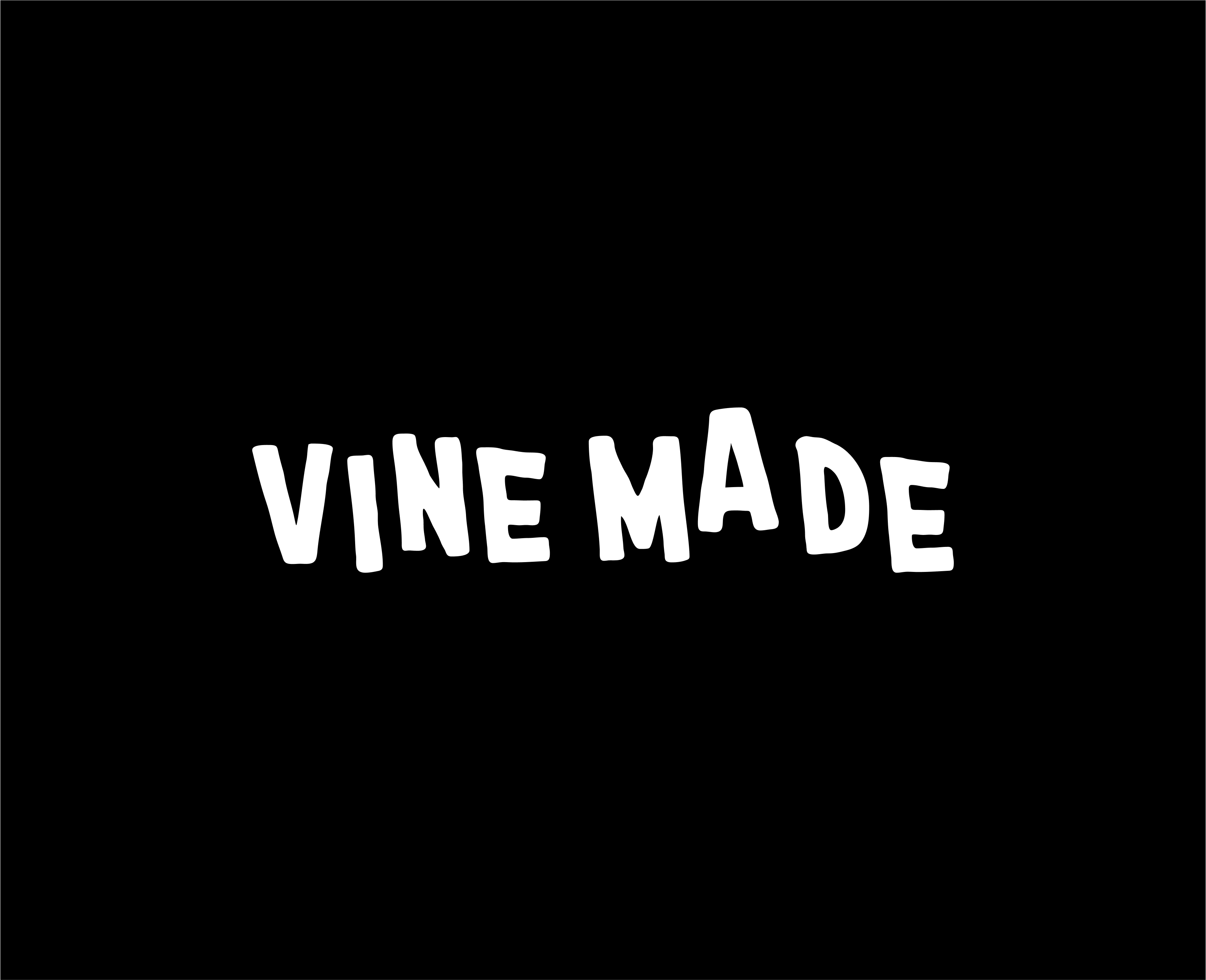
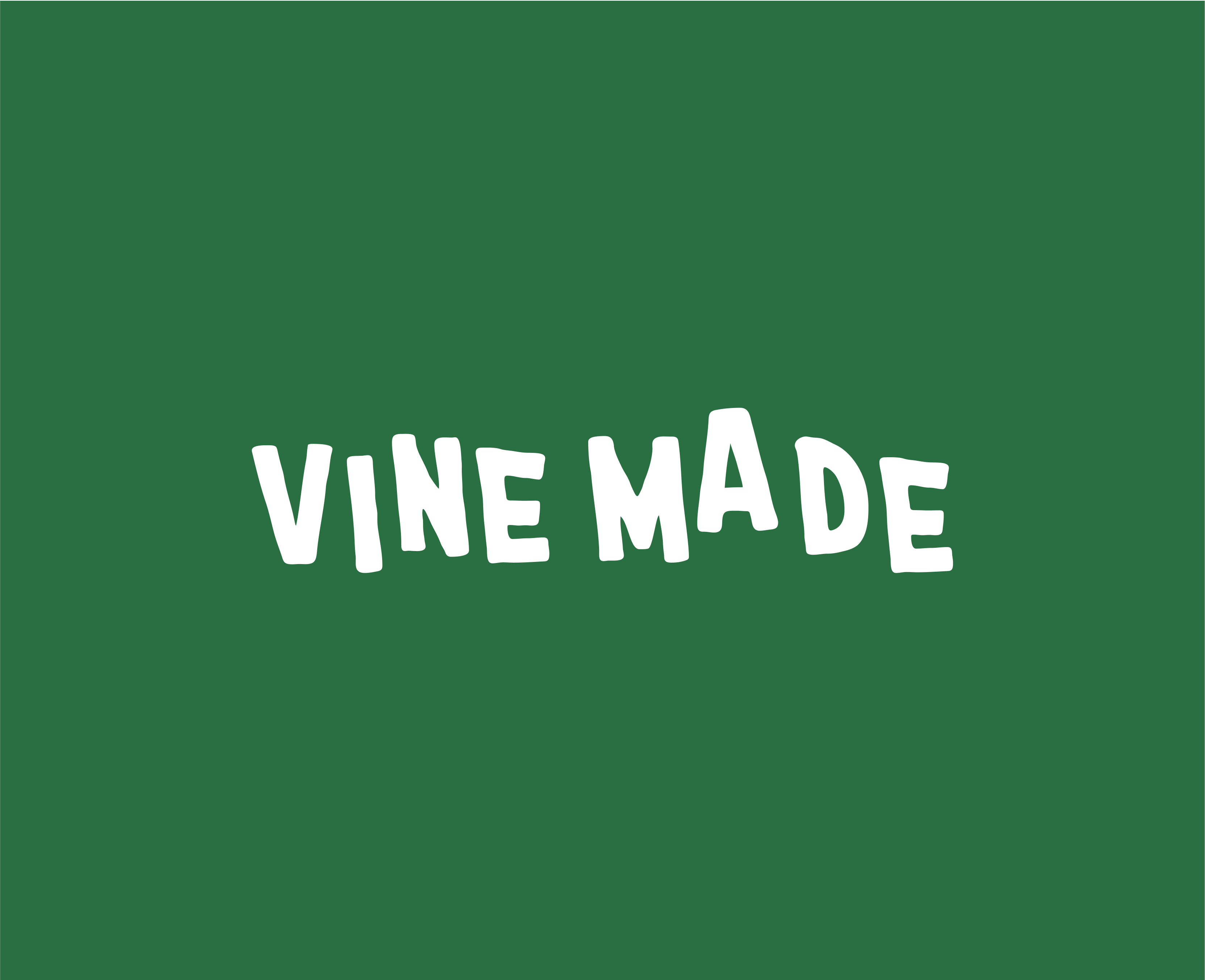
These are the color pairings and primary logo. They represent the vintage and comforting spirit of the brand through the stacked imperfect lettering. The hand-drawn elements communicate a sense of human connection, playfulness & are not meant to be uniform.

Colors︎︎︎
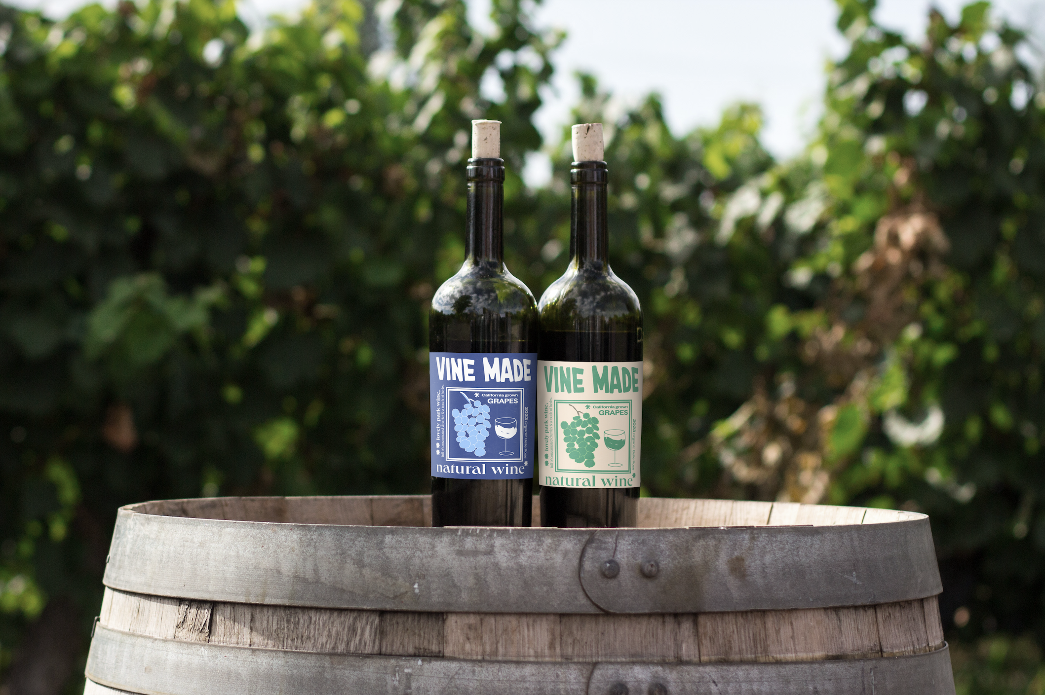
A mix of vibrant + rich primary and secondary color combinations including Emerald Green, Royal Blue & Smokey Maroon that create feelings of trust and comfortability. These bold colors pair nicely with soft tones of creams & blacks to highlight important brand messaging as well as making type stand out.

Labels︎︎︎
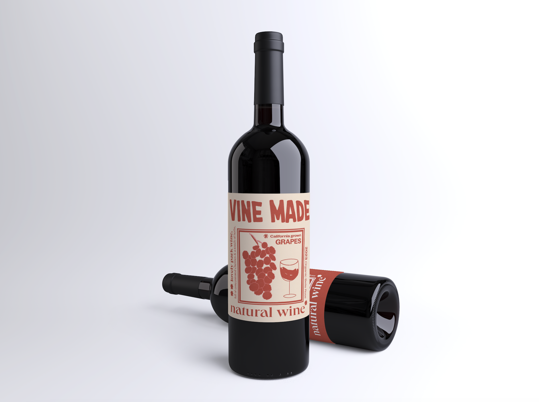
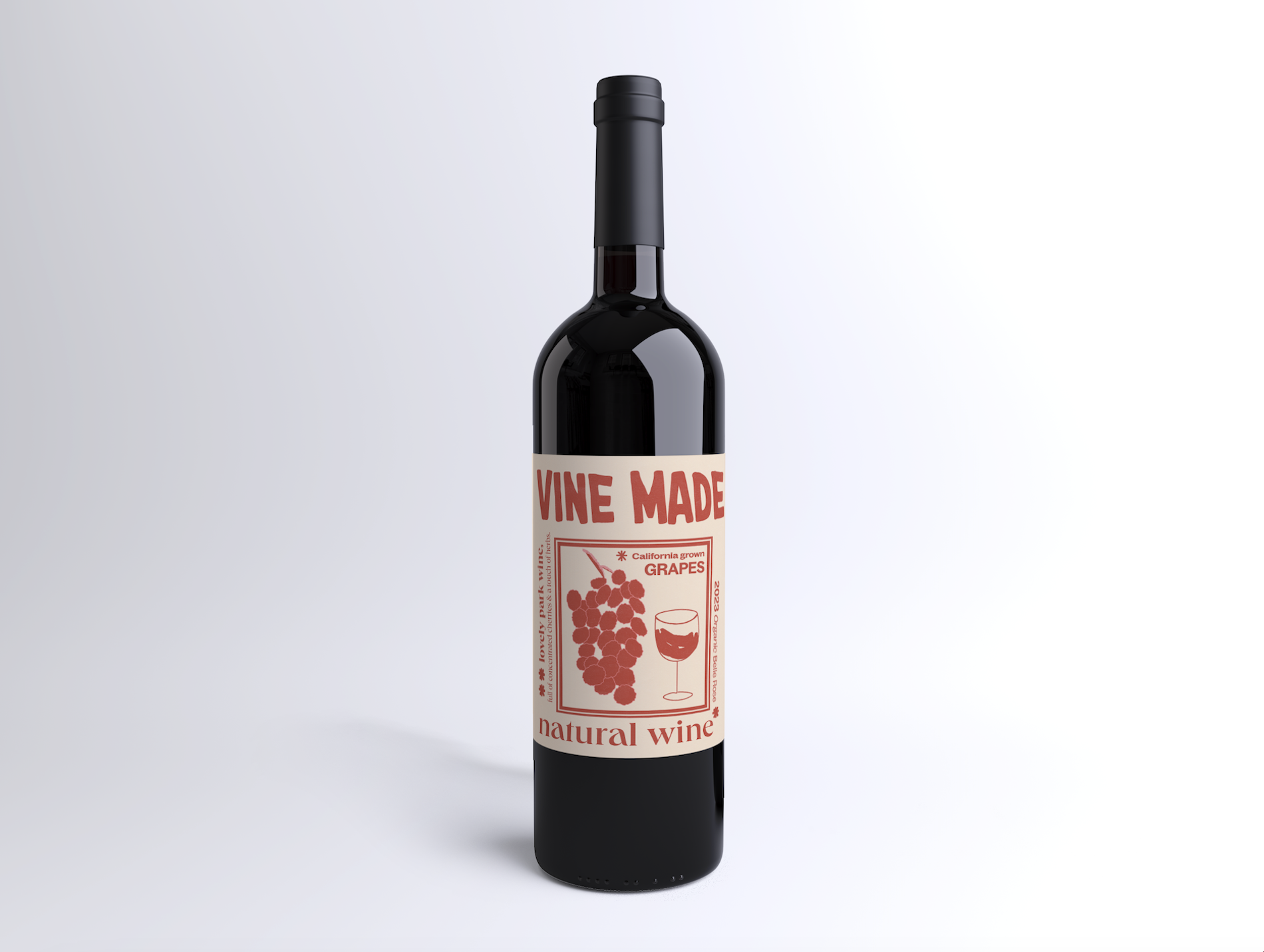
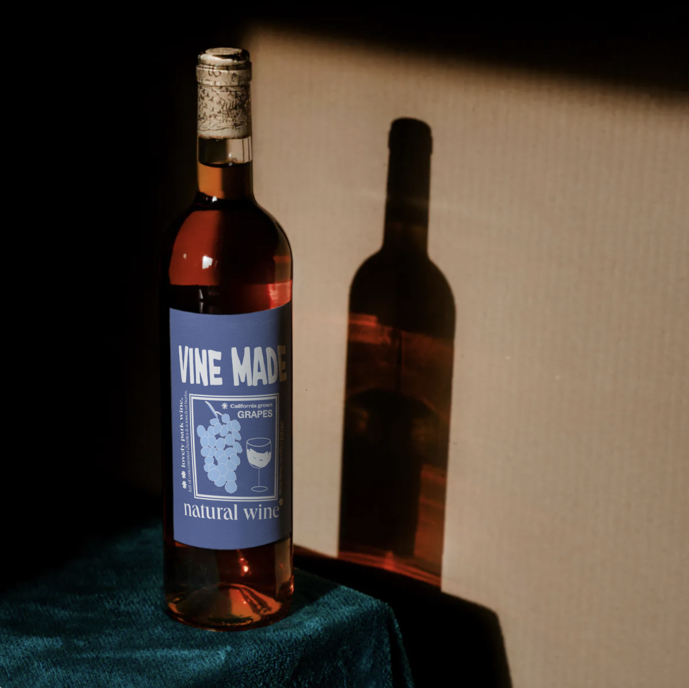
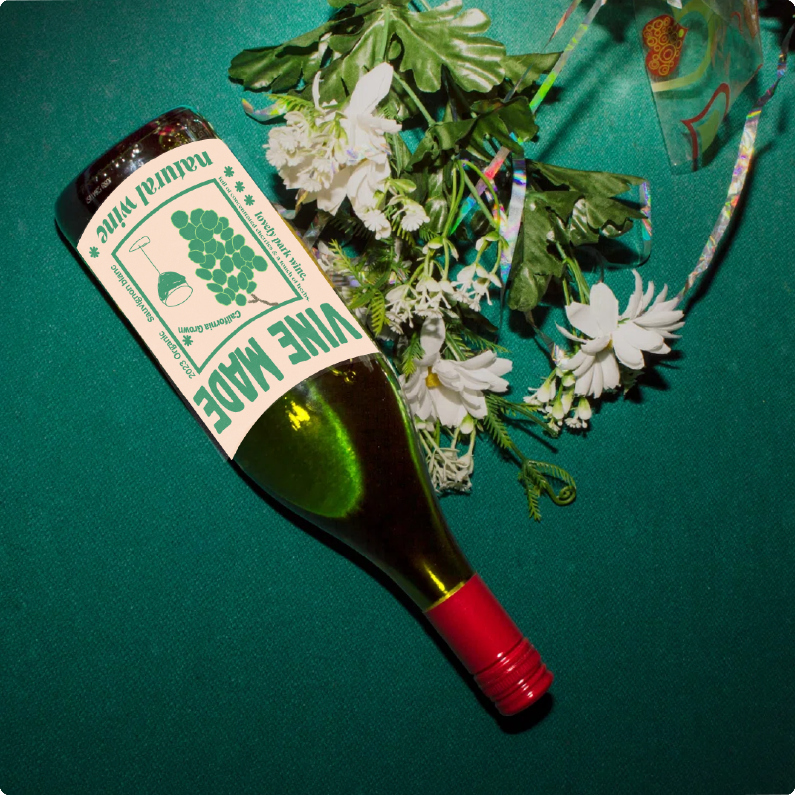
These bottle label designs play an important role in expanding Vine Made's visual language. Paper and ink textures add a vintage and tactile feel that make the visuals feel more comforting and personal.
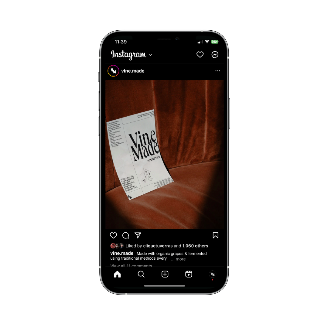
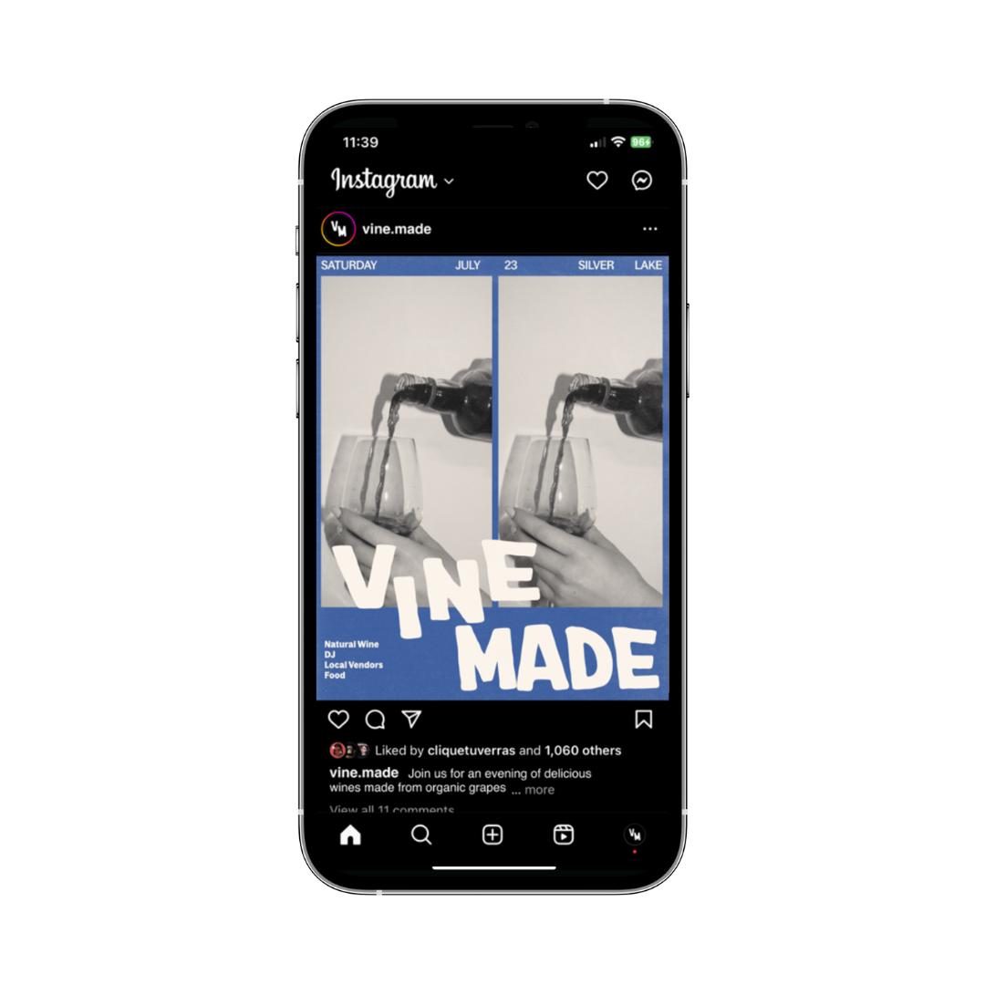
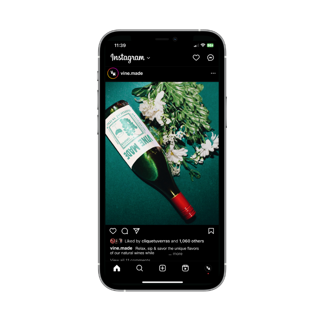

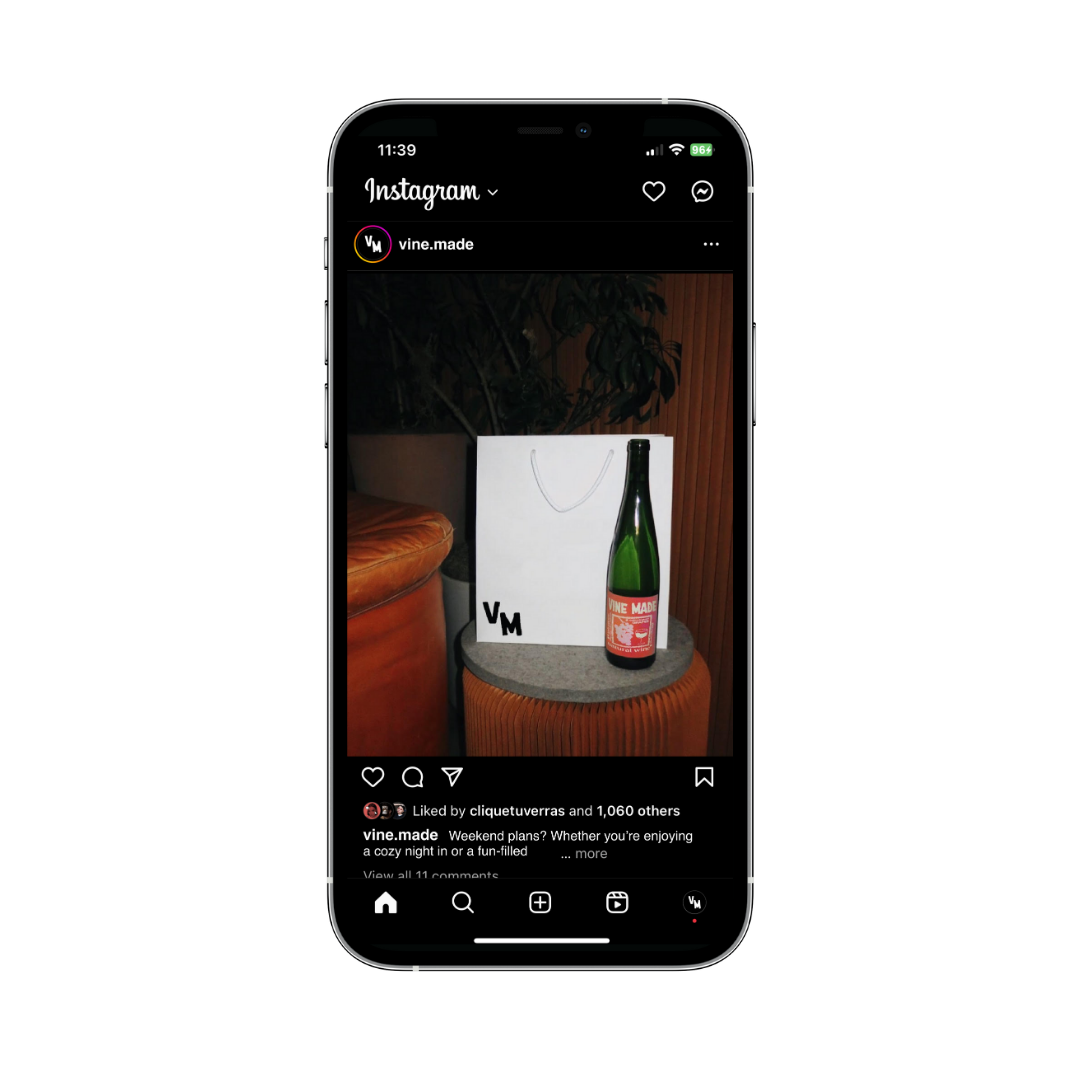


Instagram Reels + Posts ︎︎︎
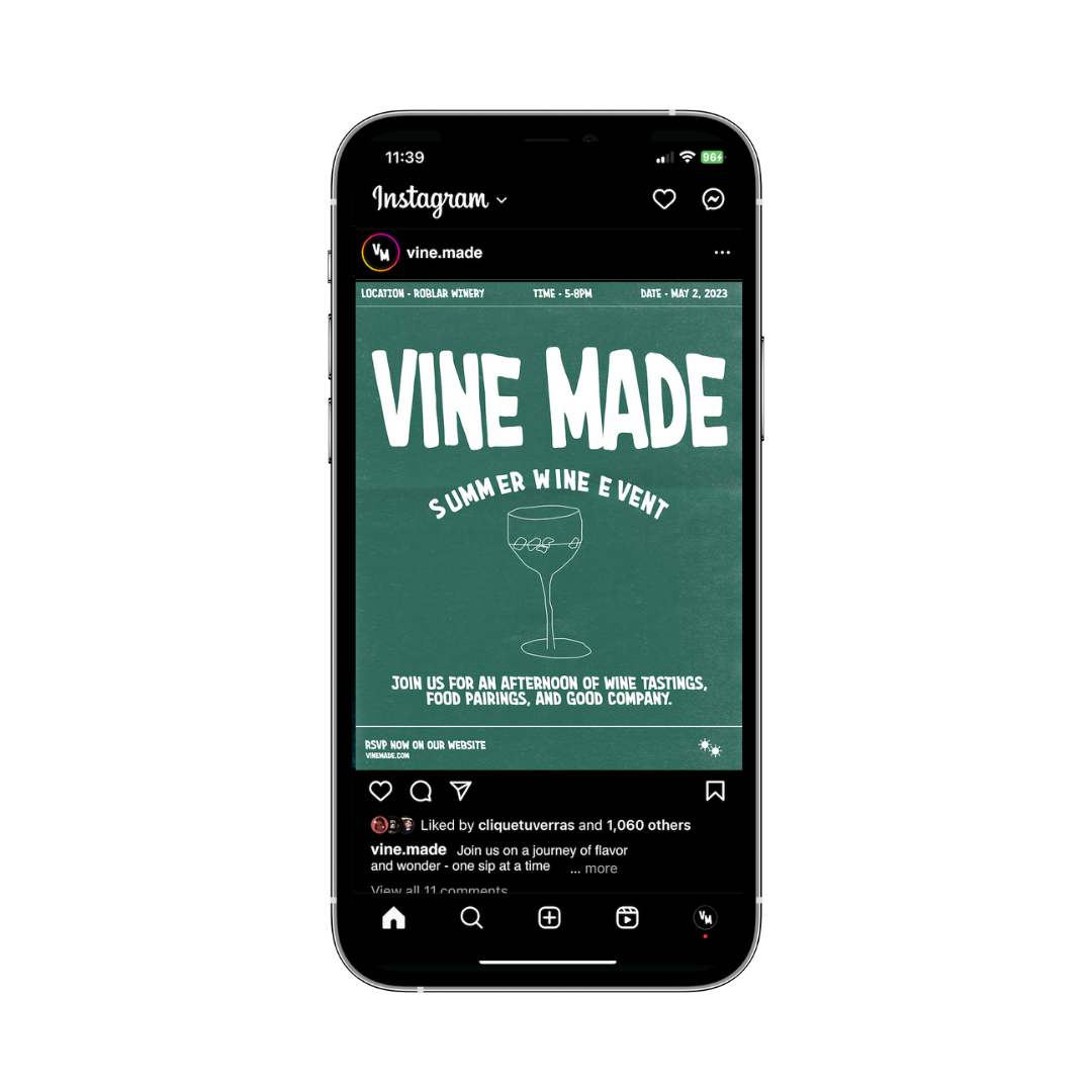
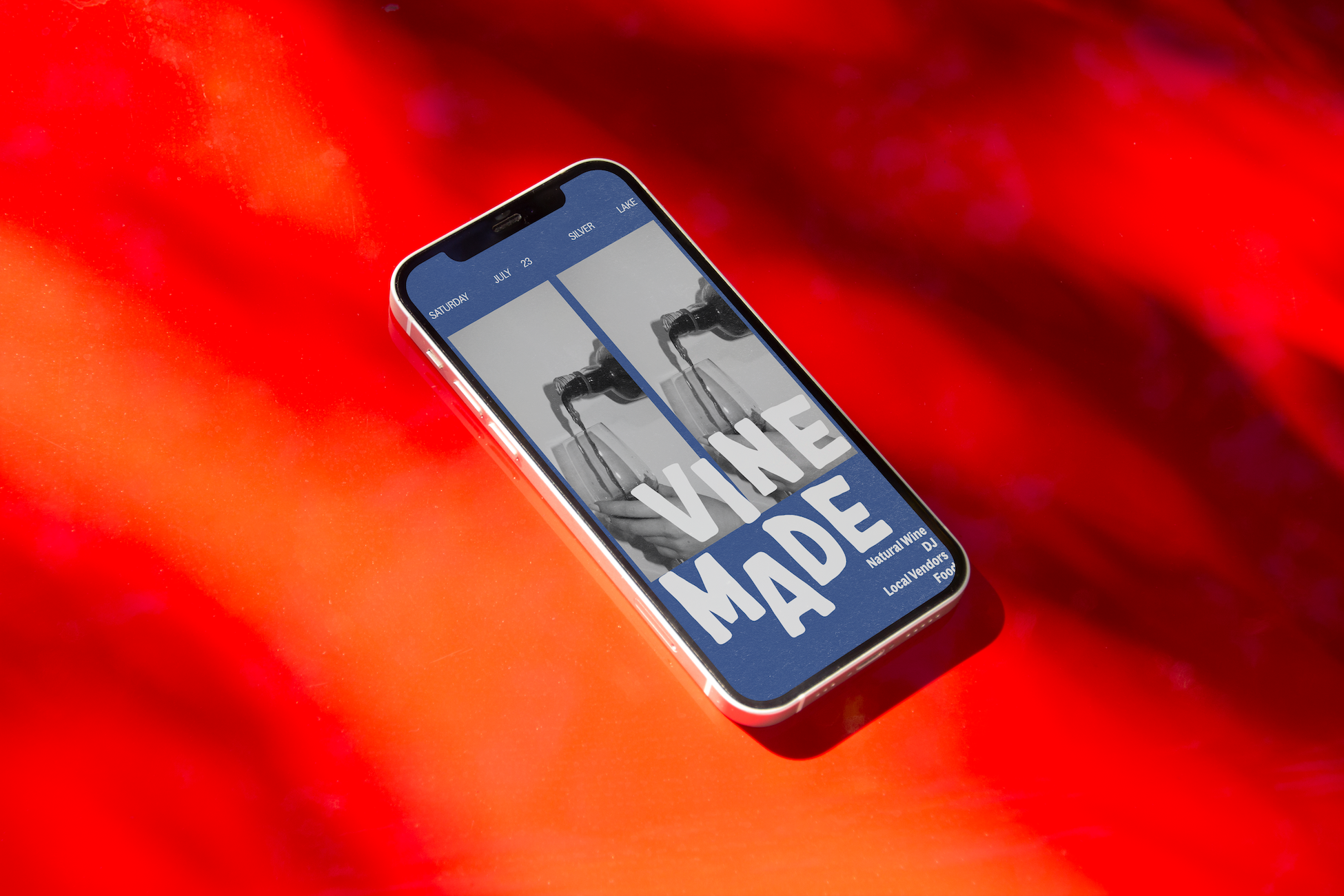
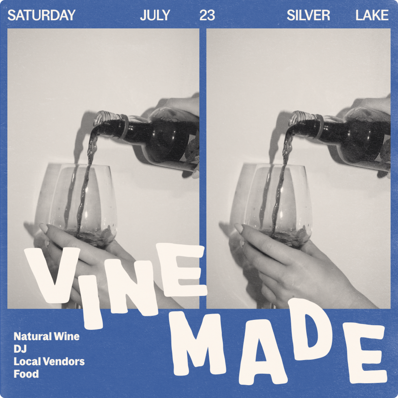
Layout of Instagram social grid templates for in-feed posts, stories & reels. The art direction strikes a balance between vintage elements & the film noir genre. The overall goal of the social deliverables are meant to evoke feelings of comfort while showcasing the lifestyle elements of the brand.
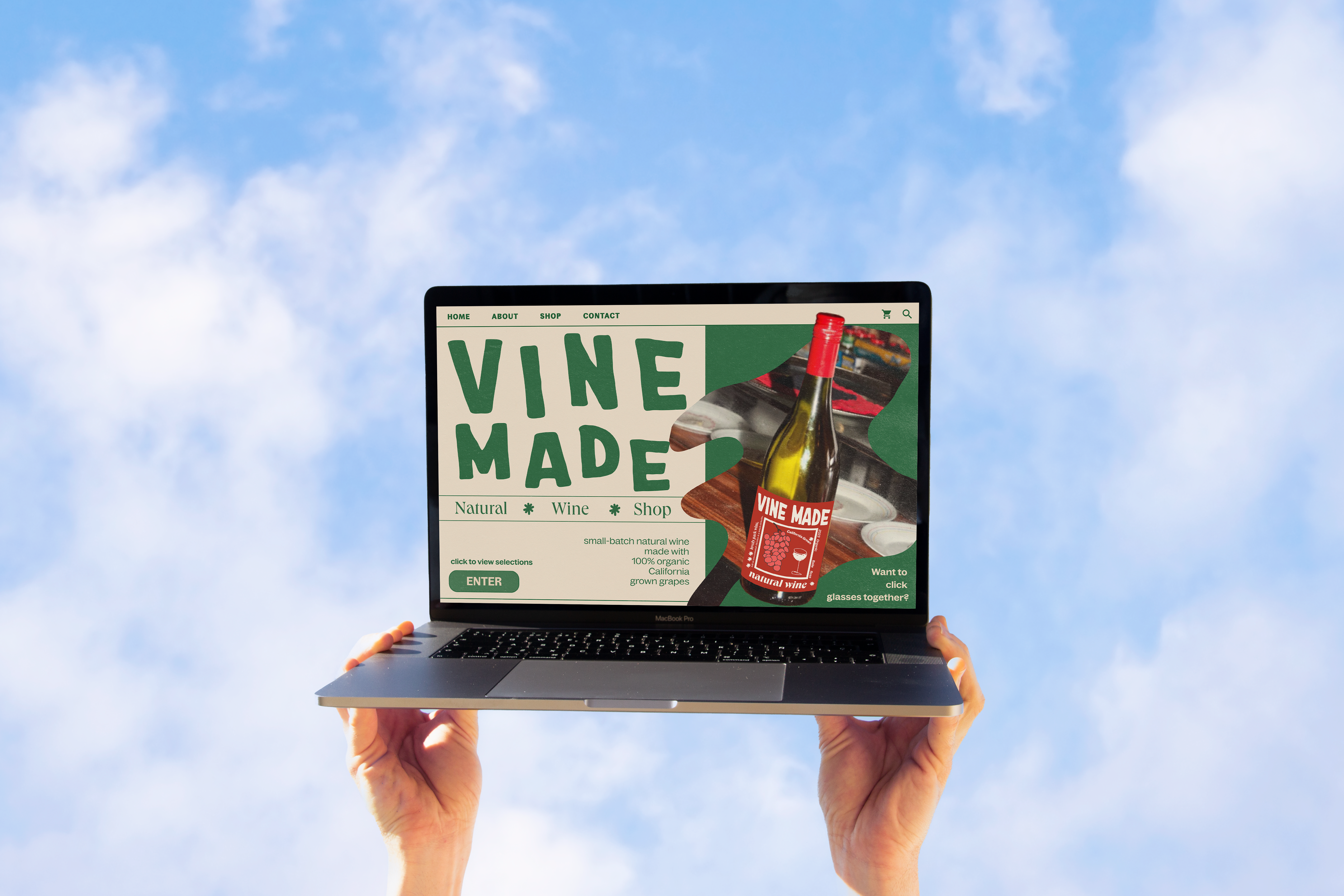
Landing Page ︎︎︎
The desktop landing page reflects the tone of the brand encompassing organic typographic layouts, rich vintage textures to enhance the vintage feel & hand-drawn graphics to create a balance between editorial copy & imagery.
