NEW ORLEANS JAZZ FEST
Overview︎︎︎
Over the course of two months, I developed a rebrand project for an existing music festival called New Orleans Jazz Festival. The challenge was finding out how to restructure the brands current visual identity & to not only keep its current target audience but to also entice a younger Gen-Z generation to attend this specific festival. My solution + process started with research & putting together a SWOT analysis for Jazz Fest & from there I created a 10-page mini-zine, social media deliverables, poster series and a full set of brand guidelines that reflects the festivals attributes. Additionally, I redesigned the festival's logo, designed a new color palette & typography elements to give the festival a fresh, modern look.
Services︎︎︎
Poster Series
Social Media Assets
Logo Re-Design
Brand Guidelines
10 Page Mini-Zine
Credits︎︎︎
Client
UI/UX Academic Project
Role
Lead Designer + Art Director
Location
Long Beach, CA (2022)


The Logo︎︎︎
As part of the rebranding process, I took the festivals original logo & evolved it by updating the graphics, color palette & typography to be bolder, modern & more engaging, making it appeal to a younger target audience.

The Colors︎︎︎
As part of the rebranding process, I took the festivals original logo & evolved it by updating the graphics, color palette & typography to be bolder, modern & more engaging, making it appeal to a younger target audience.


Poster Series︎︎︎
I designed the poster series to incorporate dynamic & bold background colors, oversized custom graphics & minimal text. The powerful use of contrast, alignment, repetition & proximity helps to create a more memorable story that will make an impact on the target audience.


Social Media Assets︎︎︎
I created two Instagram stories & 2 square posts that are strong, simple, eye-catching & straight to the point. The idea is for consumers to see the ads & to create a call to action to visit the Jazz Fest website for more information.


Mini Zine︎︎︎
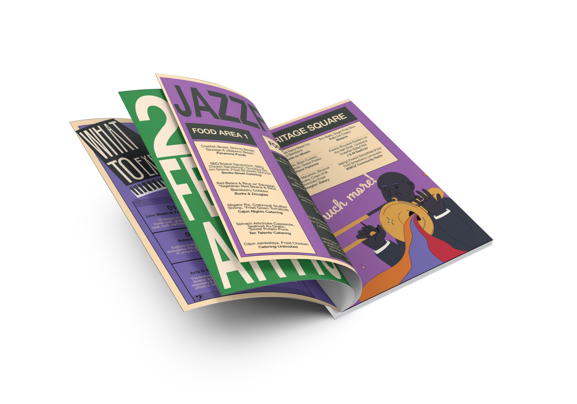
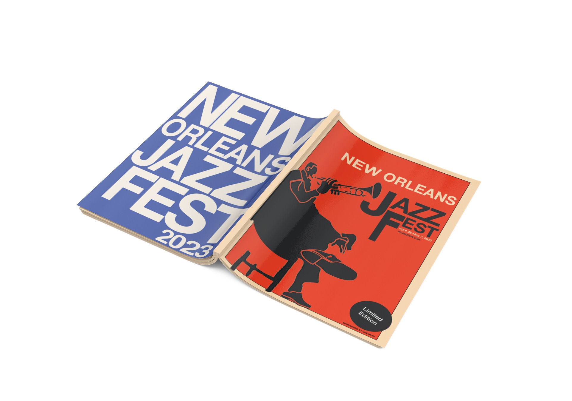
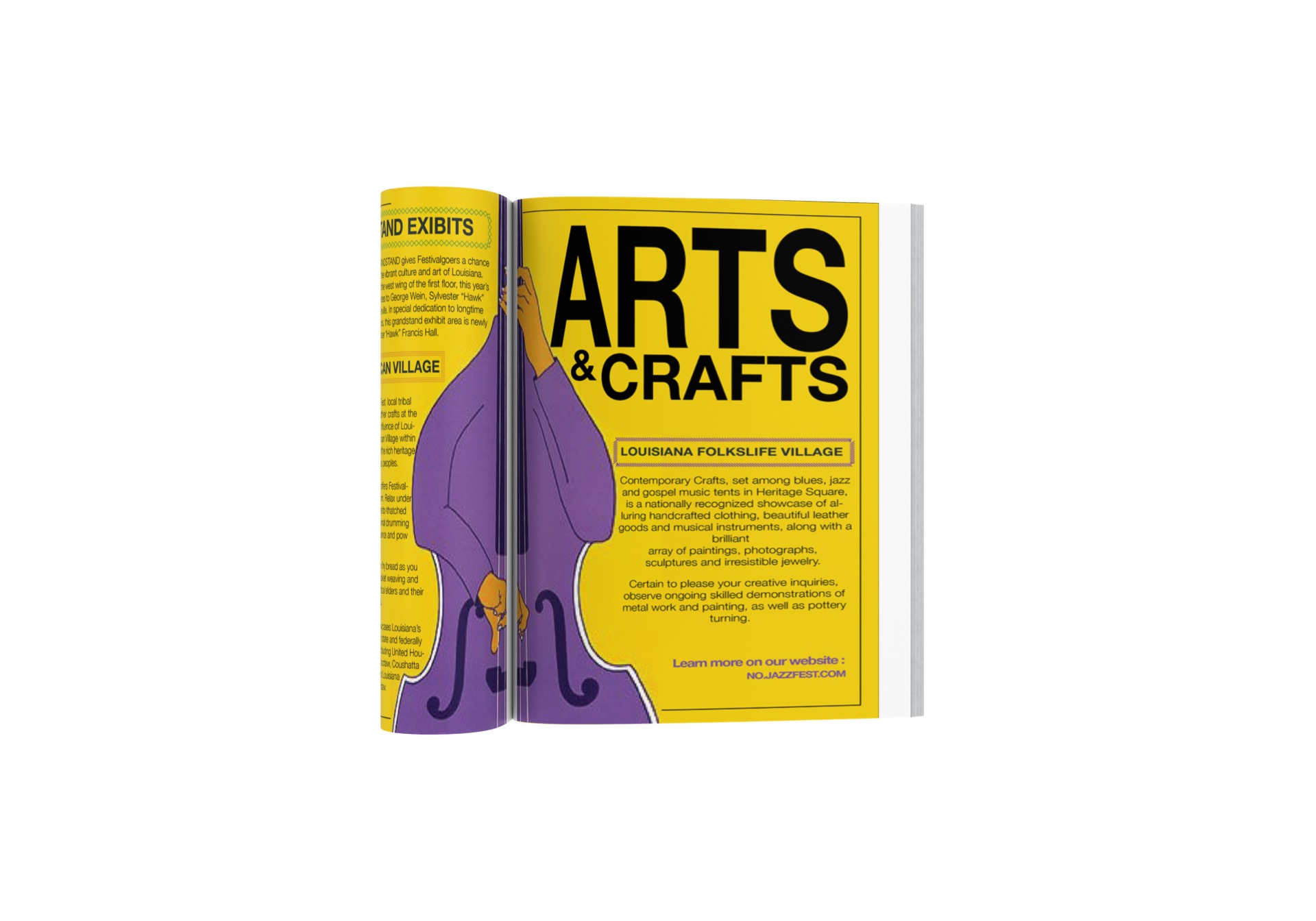
To create the 10 page mini-zine, I used the poster series aesthetic as a starting point and incorporated repeated graphics and typography to maintain the overall story while introducing playful elements. I utilized Illustrator and Photoshop to create bold fonts and graphic shapes, and In-Design to layout the zine to feel like a collectible coffee table book with a balance of white space, contrast, and proximity.
